

LOGO DESIGN
- lorenzo butturini

- Oct 22, 2020
- 1 min read
Updated: Jan 6, 2021

Lately, I have been thinking about ways to improve my logo design. Initially, I came up with a Logo which involved using dark colours (for the background) and silvery and glowing colours for the writing. Despite liking the design at the time, I realise now how overwhelming it looks. Therefore, in the last couple of days, I tried to simplify it as much as I could. First of all, I decided to change the font I used in the first version.
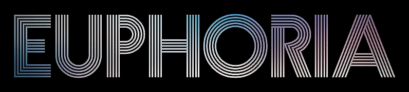
This initial font was inspired by Euphoria (American drama show, 2019) (picture on the left) and it involved the use of an elaborate font.

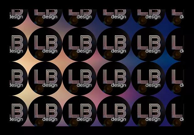
For my new Logo (on the right), I wanted to follow a completely different path. Everything has now changed, from the colour palette to the font itself. I decided to go for a more sober colour palette that involved a mixture of warm and cold colours (orange and dark green). For the font, I decided to take all the ornaments off. To do so, I used white lines to create a balance with the background. Also, I wanted to organise the writing into a shape (a rectangle). To do so, I decided to reverse the letter B, giving a sense of continuity.
I believe this new Logo is a more mature and elegant version of the old one but still maintaining its essence. What I am left to do now is to adapt the whole aesthetic of my website, portfolio and CV. The next thing to do is to come up with the design for my business card.


Comments