

BUSINESS CARD
- lorenzo butturini

- Oct 26, 2020
- 2 min read
Updated: Jan 6, 2021

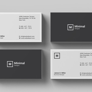
Today I decided to focus on creating a good design for my business card. Above is the final design I ended up using to promote myself to future employers. I wanted to keep the design as simple/minimal as possible. My intention was for the design not to dominate the written content of the card. The front-side only includes the Logo, whilst the back-side includes all the info (such as mobile number, email, website URL, and Instagram account). Also, I decided to play around with the colours of the font (for the name) using the same colours as the background used in the front (to have some sort of coherence within the two faces, as if one face was the negative of the other).


Coming up with the perfect design for my business card was not as easy as I expected it to be. The first thing I did was to research some good design of existing business cards. Above, a collection of pictures that inspired my design. What I found interesting about these designs were their simplicity and elegance. Most of these examples shared a similarity: using the main colours of the front page as a visual link to the back-side. Here is where I got the inspiration for my design. Also, having the logo entirely in white lighted the whole composition up.


Initially, I thought to incorporate a graphic I designed a couple of days ago (pictures above) to my business card to make it more personal. Eventually, I decided not to because it felt forced and unnecessary. Anyways, I am still going to use this graphic for my website (even though I still do not know exactly where to post it).


Comments